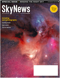
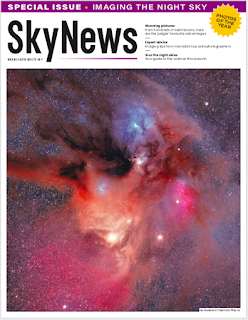
The cover of the September-October 2021 SkyNews magazine is amazing. Told the editor Allendria.
This astro-target is huge and simply wants to grow and draw us in and envelope us. With the bleed, I feel like I'm hovering in space, a couple of light-years away, soaking it all in.
The address label is unfortunately distracting.
Image of Rho Ophiuchi by Stephan Hamel.
I bought a copy at the store and the cover was slightly different with a white border and white masthead.
The theme of this issue is imaging the night sky. So, let's of great articles on imaging. I'm published in this edition with my article "astrophotography on a budget."
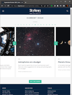
See the online snippets at the SkyNews web site for more info.
§
Took me a while to understand this.
The cover with the white border is a demand of the marketing people. They want bright colours and eye-catching text so to pull in the person scanning the magazine rack. Buy now. Buy more.
The cover without the white border, well, they don't need to do The Pitch. This version goes to the subscribers. They are already drinkin' the Kool-Aid. So we get the bigger pix and smaller text. Sadly, they need to print the mailing address, hence the garish white rectangle.


No comments:
Post a Comment